








Company /
Customer Portal Information
/
Secure Customer Access

CRTE Customer Portals

Manage service activity, equipment support, quotes, orders, invoices, payments, statements, and account records through CRTE’s connected customer systems.

CRTE currently uses two separate secure portals: one for service and technical support, and one for accounting and order management. Your login credentials may be different for each portal.

Choose the portal that matches what you need

Both systems are secure and connected to the CRTE team. Select the service portal for equipment support, or the accounting portal for orders, invoices, payments, and account records.

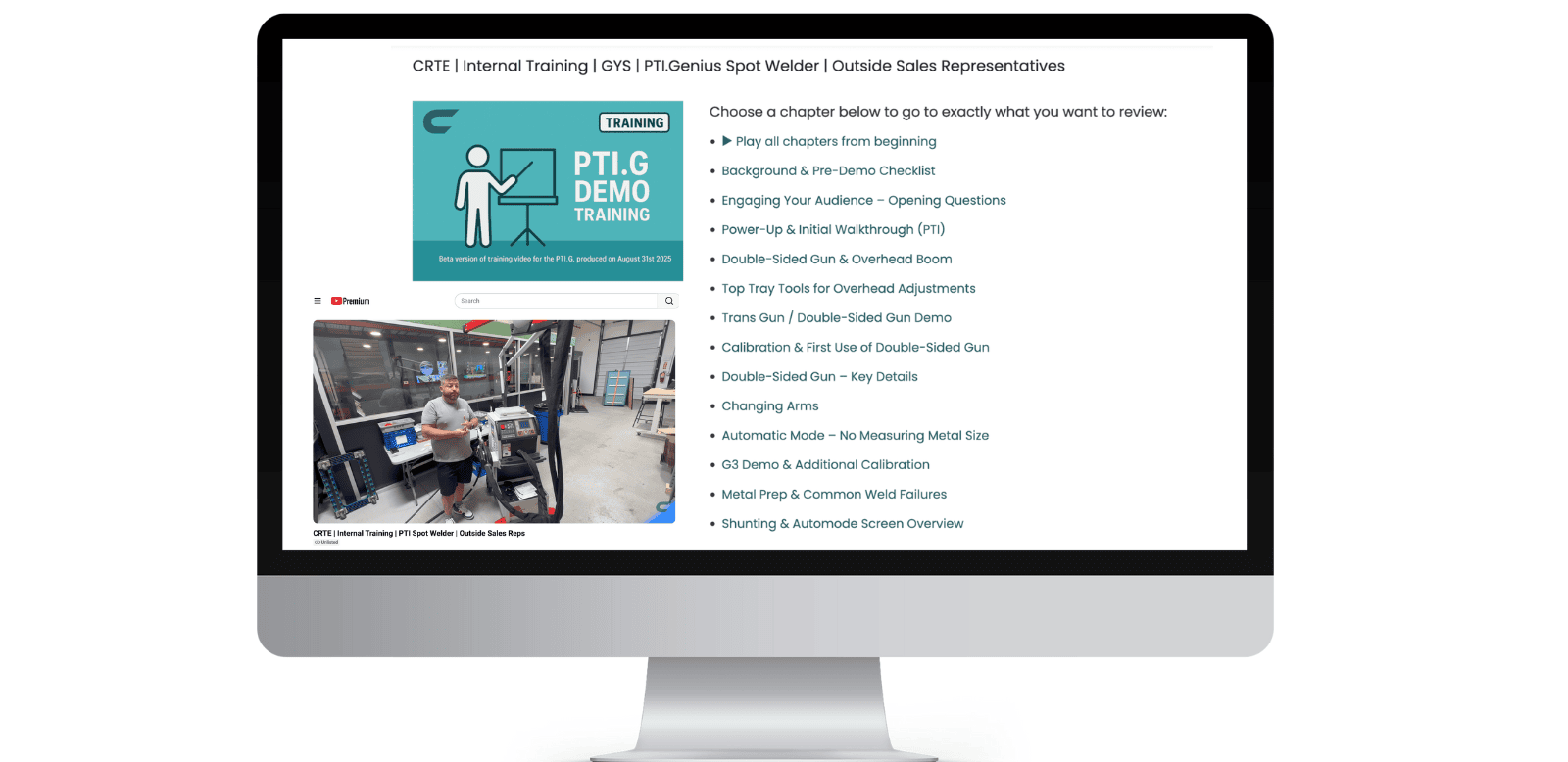
CRTE service and support resources shown on a computer screen
Service, support and technical resources

Service & Support Portal

Stay connected with CRTE’s technical team and manage your equipment service needs from one secure location.

Use this portal to
  • Open a new service, repair, or maintenance ticket
  • Follow the status of open service requests
  • Review equipment service and repair history
  • Upload photos, files, and supporting documents
  • Communicate directly with the CRTE technical team
Open Service Portal

New users can sign up or request access through the service portal.
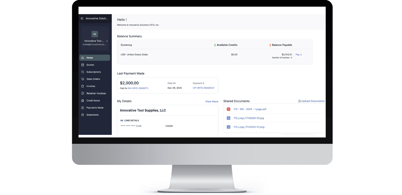
CRTE accounting and order portal shown on a computer screen
Orders, invoices, payments and account records

Accounting & Orders Portal

View and manage the financial and order-related activity connected to your CRTE customer account.

Use this portal to
  • View quotes, sales orders, and invoices
  • Review credit notes and payment history
  • Check your current account balance
  • Make secure online payments
  • Download statements and shared account documents
  • Review active subscriptions and account details
Open Accounting Portal

Accounting portal access may require an invitation from CRTE.

Not sure which portal to use?

Use the guide below to get to the correct system without wasting time.

Equipment, repairs, or technical help

Choose the Service & Support Portal for equipment problems, maintenance, repair updates, service records, attachments, and communication with the technical team.

Quotes, orders, invoices, or payments

Choose the Accounting & Orders Portal for quotes, sales orders, invoices, credit notes, balances, statements, payment history, subscriptions, and account documents.

Secure access through CRTE’s connected Zoho systemsBecause the service and accounting portals are currently separate systems, one login may not work for both. Single sign-on may be introduced in the future, but customers should currently use the credentials assigned to each portal.

Still need help finding the right place?

Our team can help with portal access, account invitations, equipment support, service requests, and general customer questions.

Call 973-768-9812sales@innovativecrte.comMonday–Friday, 8:00 AM–5:00 PM EST
Items have been added to cart.
One or more items could not be added to cart due to certain restrictions.
Close
Added to cart
- There was an error adding to cart. Please try again.
Quantity updated
- An error occurred. Please try again later.
Deleted from cart
- Can't delete this product from the cart at the moment. Please try again later.
.curved-box { box-sizing: border-box !important; width: 100% !important; margin: 0 !important; padding: 10px !important; border-radius: 15px !important; background: #fff !important; border-right: 1px solid #306166 !important; border-bottom: 1px solid #306166 !important; border-top: 1px solid #ddd !important; border-left: 1px solid #ddd !important; box-shadow: 8px 8px 20px rgba(0, 0, 0, 0.3), -4px -4px 10px rgba(255, 255, 255, 0.6) !important; } /* ================================ 1. TRADE SHOW BOX (SAFE CLONE) ================================ */ .curved-box-grid { box-sizing: border-box; width: 100%; margin: 0; padding: 10px; border-radius: 15px; background: #fff; border-right: 1px solid #306166; border-bottom: 1px solid #306166; border-top: 1px solid #ddd; border-left: 1px solid #ddd; box-shadow: 8px 8px 20px rgba(0, 0, 0, 0.3), -4px -4px 10px rgba(255, 255, 255, 0.6); } /* ================================ 2. DIVIDER LINES (PERFECT SYMMETRY) ================================ */ .curved-box-grid > * { border-right: 1px solid #ddd !important; padding-right: 20px !important; padding-left: 20px !important; } .curved-box-grid > *:last-child { border-right: none !important; } @media (max-width: 992px) { .curved-box-grid > * { border-right: none !important; padding-right: 10px !important; padding-left: 10px !important; border-bottom: 1px solid #ddd !important; padding-bottom: 25px !important; margin-bottom: 25px !important; } .curved-box-grid > *:last-child { border-bottom: none !important; padding-bottom: 0 !important; margin-bottom: 0 !important; } } .promo-container { border-radius: 12px; padding: 20px; border: 4px dashed #333333; border-image: repeating-linear-gradient( to right, #333333 0, #333333 10px, transparent 10px, transparent 20px ) 4; box-shadow: 0 4px 10px rgba(0, 0, 0, 0.15); background: transparent !important; } @supports not (border-image: unset) { .promo-container { border: 4px dashed #333333; } } .megamenu img, .mega-menu img { cursor: pointer; transition: all 0.2s ease; } .megamenu img:hover, .mega-menu img:hover { transform: translateY(-4px) scale(1.03); box-shadow: 0 10px 20px rgba(0, 0, 0, 0.15); } /* --- Product hover --- */ .product-item, .product-card, .product-inner, .zs-product, .zs-product-box, .zs-product-container, .product-item *, .product-card *, .product-inner *, .zs-product *, .zs-product-box *, .zs-product-container * { cursor: pointer !important; } .product-item, .product-card, .product-inner, .zs-product, .zs-product-box, .zs-product-container { transition: all 0.25s ease !important; } .product-item:hover, .product-card:hover, .product-inner:hover, .zs-product:hover, .zs-product-box:hover, .zs-product-container:hover, .product-item:focus, .product-card:focus, .product-inner:focus, .zs-product:focus, .zs-product-box:focus, .zs-product-container:focus { border: 2px solid #306166 !important; outline: none !important; box-shadow: 0 8px 18px rgba(0, 0, 0, 0.15) !important; transform: translateY(-3px) !important; } .product-item:hover *, .product-card:hover *, .product-inner:hover *, .zs-product:hover *, .zs-product-box:hover *, .zs-product-container:hover * { outline-color: transparent !important; } .product-item:hover .product-details, .product-card:hover .product-details, .product-inner:hover .product-details, .zs-product:hover .product-details, .zs-product-box:hover .product-details, .zs-product-container:hover .product-details, .product-item:hover .product-image, .product-card:hover .product-image, .product-inner:hover .product-image, .zs-product:hover .product-image, .zs-product-box:hover .product-image, .zs-product-container:hover .product-image, .product-item:hover .product-inner, .product-card:hover .product-inner, .zs-product:hover .zs-product-inner, .zs-product-box:hover .zs-product-inner, .zs-product-container:hover .zs-product-inner { border-color: #306166 !important; outline: none !important; box-shadow: none !important; } /* ===== HEADER LAYOUT ===== */ header, .zs-header, .zsite-header, .zpheader-style-01, .navbar, .main-header, .header-transparent, .transparent-header, .is-transparent, [data-header-style="transparent"] { position: fixed !important; top: 0; left: 0; width: 100%; height: auto !important; z-index: 9999 !important; opacity: 1 !important; filter: none !important; } /* Default offset for pages without hero */ body { padding-top: 0px !important; } /* Hero pages stay flush at top */ body:has(.hero), body:has(.hero-banner), body:has(.banner), body:has(.slideshow), body:has(.home-hero), body:has(.section-slider), body:has([data-section-type="hero"]), body:has([data-section-type="slider"]) { padding-top: 0 !important; } /* Keep hero flush */ .hero, .hero-banner, .banner, .slideshow, .home-hero, .section-slider, [data-section-type="hero"], [data-section-type="slider"] { margin-top: 0 !important; } /* Dropdown layering */ header ul ul, header .dropdown, header .submenu, .zs-header ul ul, .zs-header .dropdown, .zs-header .submenu, .zsite-header ul ul, .zsite-header .dropdown, .zsite-header .submenu, .zpheader-style-01 ul ul, .zpheader-style-01 .dropdown, .zpheader-style-01 .submenu, .navbar ul ul, .navbar .dropdown, .navbar .submenu, .main-header ul ul, .main-header .dropdown, .main-header .submenu, .megamenu, .mega-menu { z-index: 10001 !important; } /* ===== UNIFIED HEADER COLOR (WHITE BACKGROUND) ===== */ .theme-header, .theme-header .theme-header-topbar, .theme-header .theme-topbar, .theme-header .theme-header-main, .theme-header .header-middle, .theme-header .theme-header-middle, .theme-header .theme-branding-area, .theme-header nav, .theme-header .theme-navigation-and-icons, .theme-header [data-zs-responsive-menu-area], .theme-header[data-dark-part-applied="false"] { background: #ffffff !important; opacity: 1 !important; filter: none !important; } /* keep inner container transparent so it does not create a second slab */ .theme-header .zpcontainer { background: transparent !important; opacity: 1 !important; filter: none !important; } /* text/icons */ .theme-header a, .theme-header span, .theme-header i, .theme-header svg { color: #000000 !important; fill: #000000 !important; opacity: 1 !important; } /* ===== REMOVE WHITE LINE / SEAM ONLY ===== */ .theme-header, .theme-header .theme-header-topbar, .theme-header .theme-topbar, .theme-header .theme-header-main, .theme-header .header-middle, .theme-header .theme-header-middle, .theme-header nav, .theme-header .theme-navigation-and-icons { border-top: none !important; border-bottom: none !important; box-shadow: none !important; } /* Restrict image cleanup to header/menu only */ .theme-branding-area img, .theme-header-main img, .megamenu img, .mega-menu img { display: block; border: none !important; } .theme-branding-area img, .theme-header-main img { opacity: 1 !important; filter: none !important; mix-blend-mode: normal !important; } /* Force 3-column grid on desktop and 1-column on mobile */ #stanzani-grid { display: grid !important; grid-template-columns: 1fr; width: 100%; } @media (min-width: 768px) { #stanzani-grid { grid-template-columns: repeat(3, 1fr) !important; } } /* Ensure cards look right inside the new grid */ .clamp-card { min-width: 0 !important; border-right: 1px solid rgb(238, 238, 238); border-bottom: 1px solid rgb(238, 238, 238); } /* Stanzani Product Page Mobile Overrides */ @media only screen and (max-width: 767px) { /* 1. Force outer tables and their rows to stack SAFELY */ table#crte-specs-row, table#crte-parts-row, table#crte-top-buttons, table#crte-brands-row, table#crte-deals-row, #crte-specs-row > tbody, #crte-parts-row > tbody, #crte-top-buttons > tbody, #crte-brands-row > tbody, #crte-deals-row > tbody, #crte-specs-row > tbody > tr, #crte-parts-row > tbody > tr, #crte-top-buttons > tbody > tr, #crte-brands-row > tbody > tr, #crte-deals-row > tbody > tr { display: block !important; width: 100% !important; } /* 2. THE MISSING LINK: Force the actual layout columns to 100% width so they stack! */ #crte-specs-row > tbody > tr > td, #crte-parts-row > tbody > tr > td, #crte-top-buttons > tbody > tr > td, #crte-brands-row > tbody > tr > td, #crte-deals-row > tbody > tr > td, .stack-col { display: block !important; width: 100% !important; box-sizing: border-box !important; padding-left: 0 !important; padding-right: 0 !important; padding-bottom: 25px !important; } /* 3. Keep the inner Parts List swiping sideways */ .crte-parts-table-wrap { width: 100% !important; overflow-x: auto !important; -webkit-overflow-scrolling: touch !important; } /* Fix the parts table text for mobile */ #crte-parts-table th, #crte-parts-table td { font-size: 12px !important; padding: 6px 4px !important; word-break: break-word !important; } /* Target buttons and images for full-width */ .crte-brand-button, .crte-deal-image, .crte-top-button-link { display: block !important; width: 100% !important; box-sizing: border-box !important; } .crte-brand-logo-box { height: auto !important; min-height: 90px !important; } } /* ================================ 4. RESPONSIVE GRID TABLES (BRANDS & DEALS) ================================ */ @media only screen and (max-width: 767px) { .crte-grid-table, .crte-grid-table tbody, .crte-grid-table tr, .crte-grid-table td { display: block !important; width: 100% !important; box-sizing: border-box !important; } /* Adds breathing room between the items once they stack */ .crte-grid-table td { padding-bottom: 20px !important; } } /* --- THE SILVER BULLET: HIDE ALL PRODUCT SOCIAL SHARING --- */ /* 1. Target the main wrapper by Zoho data-attribute */ [data-zs-product-share], [data-zs-social-share], .zs-product-share, .zpsocial-share-container, .zp-share-container { display: none !important; visibility: hidden !important; height: 0 !important; width: 0 !important; opacity: 0 !important; margin: 0 !important; padding: 0 !important; overflow: hidden !important; } /* 2. Target the specific horizontal list of icons */ .zpsocial-share-icons, .theme-social-share, .zpsocial-share-icons-container { display: none !important; } /* 3. Hide any remaining individual social link buttons by their data types */ [data-social-icon="facebook"], [data-social-icon="twitter"], [data-social-icon="linkedin"], [data-social-icon="x"], .zpsocial-share-container a { display: none !important; } /* --- ENHANCED PRODUCT QUICK-SPECS --- */ [data-zs-product-short-description] { font-family: 'Inter', sans-serif; /* Cleaner, modern look */ line-height: 1.8 !important; font-size: 15px !important; color: #ffffff !important; padding-bottom: 10px; } /* Style the labels (e.g., Capacity, Material) */ [data-zs-product-short-description] b, [data-zs-product-short-description] strong { color: #00d4ff !important; /* A 'Cyan/Electric Blue' to pop against the green */ text-transform: uppercase; font-size: 12px; letter-spacing: 1.2px; margin-right: 8px; } /* Add a subtle underline to the 'Serviceable' note at the bottom */ [data-zs-product-short-description] em { display: block; margin-top: 12px; padding-top: 12px; border-top: 1px dashed rgba(255,255,255,0.3); font-style: normal; font-size: 13px; color: #e0e0e0; } /* --- GLASS EFFECT FOR DESCRIPTION AREA --- */ [data-zs-product-short-description] { background: rgba(255, 255, 255, 0.08) !important; /* Extremely subtle white tint */ padding: 15px !important; border-radius: 10px !important; border: 1px solid rgba(255, 255, 255, 0.15) !important; box-shadow: inset 0 0 10px rgba(0, 0, 0, 0.05) !important; } /* --- PREMIUM SIDEBAR POLISH --- */ [data-zs-product-variant-selectors-container] { background: linear-gradient(145deg, #306166 0%, #254a4e 100%) !important; border: 1px solid rgba(255, 255, 255, 0.1) !important; box-shadow: 0 10px 30px rgba(0, 0, 0, 0.2) !important; padding: 25px !important; border-radius: 12px !important; } /* ===== HOMEPAGE ONLY: HIDE BREADCRUMB ===== */ body:has(.crte-home-hero) .zs-breadcrumb, body:has(.crte-home-hero) .zs-breadcrumb-container, body:has(.crte-home-hero) .zs-page-title, body:has(.crte-home-hero) .zs-page-header, body:has(.crte-home-hero) .zs-page-header-container, body:has(.crte-home-hero) .theme-breadcrumb, body:has(.crte-home-hero) .theme-breadcrumb-container { display: none !important; height: 0 !important; margin: 0 !important; padding: 0 !important; overflow: hidden !important; visibility: hidden !important; } /* Clean up leftover spacing */ body:has(.crte-home-hero) .theme-content-area, body:has(.crte-home-hero) .zs-content-area, body:has(.crte-home-hero) .zs-main-content { margin-top: 0 !important; padding-top: 0 !important; } .crte-home-hero h1 { color: #ffffff !important; } .crte-side-promo h3, .crte-side-promo h3 * { color: #ffffff !important; } .crte-gys-pti-img{ aspect-ratio: 1 / 1; background-size: cover; background-position: center center; } .crte-gys-pti-img-neo{ background-position:center top; } .crte-gys-pti-img-genius-plus{ background-position:center center; } .crte-gys-pti-img-p3{ background-position:center center; } /* ===== FULL-WIDTH content pages (no left image) ===== */ /* Full-width when the left image is just Zoho's /500x500 placeholder (no real image set) */ .theme-category-col-left:has(img[src="/500x500"]){display:none!important;} .zprow:has(.theme-category-col-left img[src="/500x500"]) .theme-category-col-right{flex:0 0 100%!important;max-width:100%!important;width:100%!important;} .zprow:has(.theme-category-col-left img[src="/500x500"]) .theme-category-description{max-width:1000px;} /* ===== ORKO tiles ===== */ .orko-tile-grid{display:flex;flex-wrap:wrap;gap:16px;margin:6px 0 20px 0;} .orko-tile{display:block;width:180px;border:1px solid #e6e6e6;border-radius:12px;overflow:hidden;box-shadow:0 2px 10px rgba(0,0,0,.08);text-decoration:none;color:#1a1a1a;transition:transform .15s,box-shadow .15s;} .orko-tile:hover{transform:translateY(-4px);box-shadow:0 10px 22px rgba(0,0,0,.15);} .orko-tile-img{width:100%;height:150px;object-fit:contain;background:#fff;display:block;padding:8px;box-sizing:border-box;} .orko-tile-label{padding:10px;font-size:13px;font-weight:600;text-align:center;} /* ===== ORKO video ===== */ .orko-video{position:relative;display:inline-block;max-width:520px;width:100%;border-radius:12px;overflow:hidden;box-shadow:0 4px 16px rgba(0,0,0,.15);} .orko-video-play{position:absolute;top:50%;left:50%;transform:translate(-50%,-50%);background:rgba(200,0,0,.9);color:#fff;width:70px;height:48px;border-radius:12px;display:flex;align-items:center;justify-content:center;font-size:24px;} .orko-embed{position:relative;width:100%;max-width:640px;aspect-ratio:16/9;margin:8px 0;border-radius:12px;overflow:hidden;box-shadow:0 4px 16px rgba(0,0,0,.15);} .orko-embed iframe{position:absolute;top:0;left:0;width:100%;height:100%;border:0;} /* ================================ 5. PRODUCT GRID CARDS + QUICK-VIEW KILL (Aug 24, 2026) - Quick View magnifier removed sitewide: the card/image click goes straight to the product page (quick views divert buyers from the page that carries MSRP, member pricing, and fitment). - Cards get a real resting tile + prominent hover lift (approved by Nick, tested live on the spot-welding category Aug 24). - Replaces the old card block that lived in the Header box (now deleted there) so there is exactly ONE card rule set, and it is in this regular CSS box. ================================ */ .theme-product-quick-view-button { display: none !important; } .product-item, .theme-product-list-style-09, div[data-zs-product-id] { border: 1px solid #e3eaee !important; border-radius: 14px !important; background: #fff !important; box-shadow: 0 1px 3px rgba(15, 59, 60, 0.06) !important; padding: 10px !important; box-sizing: border-box !important; overflow: hidden !important; cursor: pointer !important; transition: transform 0.22s ease, box-shadow 0.22s ease, border-color 0.22s ease !important; } .product-item:hover, .theme-product-list-style-09:hover, div[data-zs-product-id]:hover { outline: none !important; border-color: #306166 !important; box-shadow: 0 0 0 1px #306166, 0 18px 38px rgba(15, 59, 60, 0.26) !important; transform: translateY(-5px) !important; z-index: 999 !important; } .theme-product-image-area { cursor: pointer !important; } Here is the Header CSS: Here is the Footer CSS code: